Ex-council house transformation
LOCATION Bermondsey, London, UK
PROGRAM Full refurbishment and remodelling of an 1980's ex-council house
AREA 80 sqm
STATUS Completed 2021
ARCHITECTURE AND INTERIOR DESIGN VATRAA
TEAM Anamaria Pircu, Bogdan Rusu
PHOTOGRAPHY Jim Stephenson
AWARDS
Winner, Don't Move Improve Awards 2021, Compact Design of the Year
Shortlisted, Best House under £250,000, AJ Retrofit Awards 2021
Highly Commended, Home Transformation of the Year, British Home Awards 2020
CLIENT REVIEW ''Throughout the build, Anamaria and Bogdan maintained the approach of listening, engaging, paying attention to the minutiae, whilst simultaneously responding to council/budgetary/lockdown constraints. In doing so, the end product is a modernised home that maximises space and light and ensures a minimalist design – which is what I wanted. I’m delighted for their Home Transformation of the Year at the British Home Awards, they deserve it and it couldn’t happen to nicer people. I couldn’t recommend them highly enough.'' Bernadette, homeowner
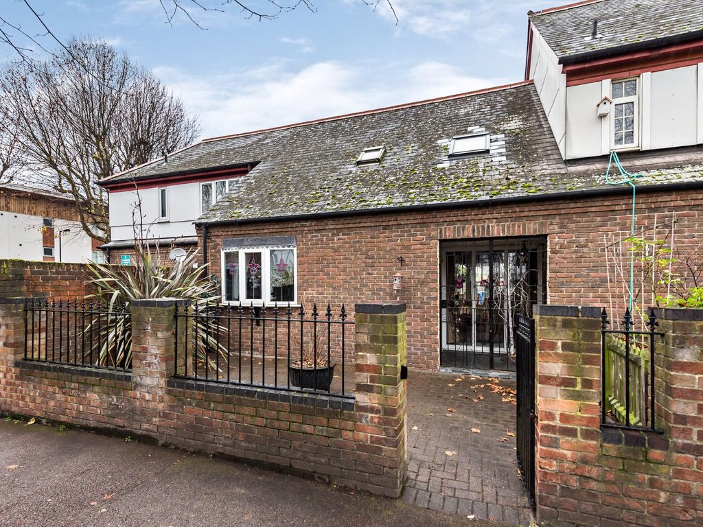
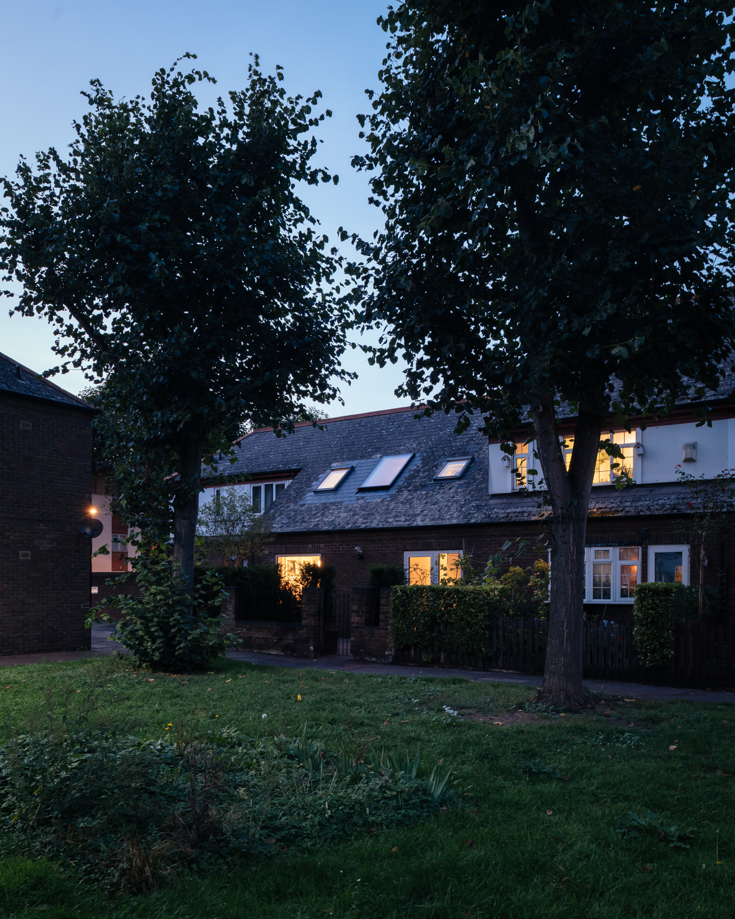
The client commissioned VATRAA for a complete refurbishment of her 1980’s ex-council house, aimed at keeping a discrete appearance on the outside, while optimising space and creating a warm, inviting atmosphere on the inside.
We saw the client’s constraints as a catalyst for practical, creative solutions. With thoughtful decisions fully grounded in the context we operated in, we managed to turn a disregarded ex-council house into a home with a distinctive character, now proud to tell its story through space, light and materials.
Our sustainability goal was to achieve more with fewer resources.
To reduce waste, we acted almost like a surgeon, first investigating the existing structure to remove the unnecessary parts only, while keeping any new additions to the minimum. As a result, the design was stripped to its essentials.
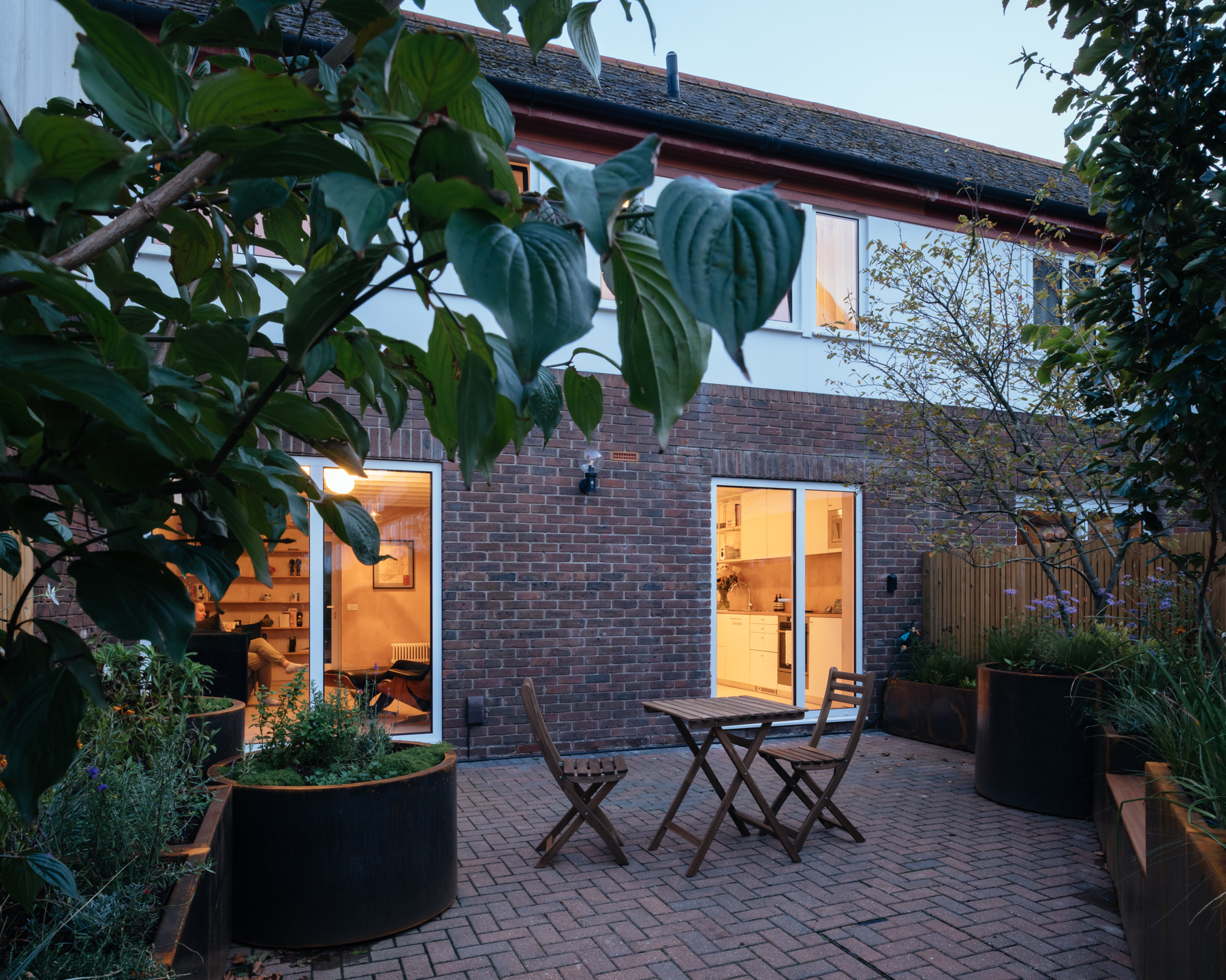
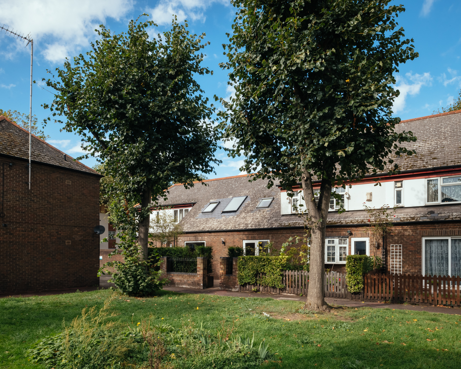
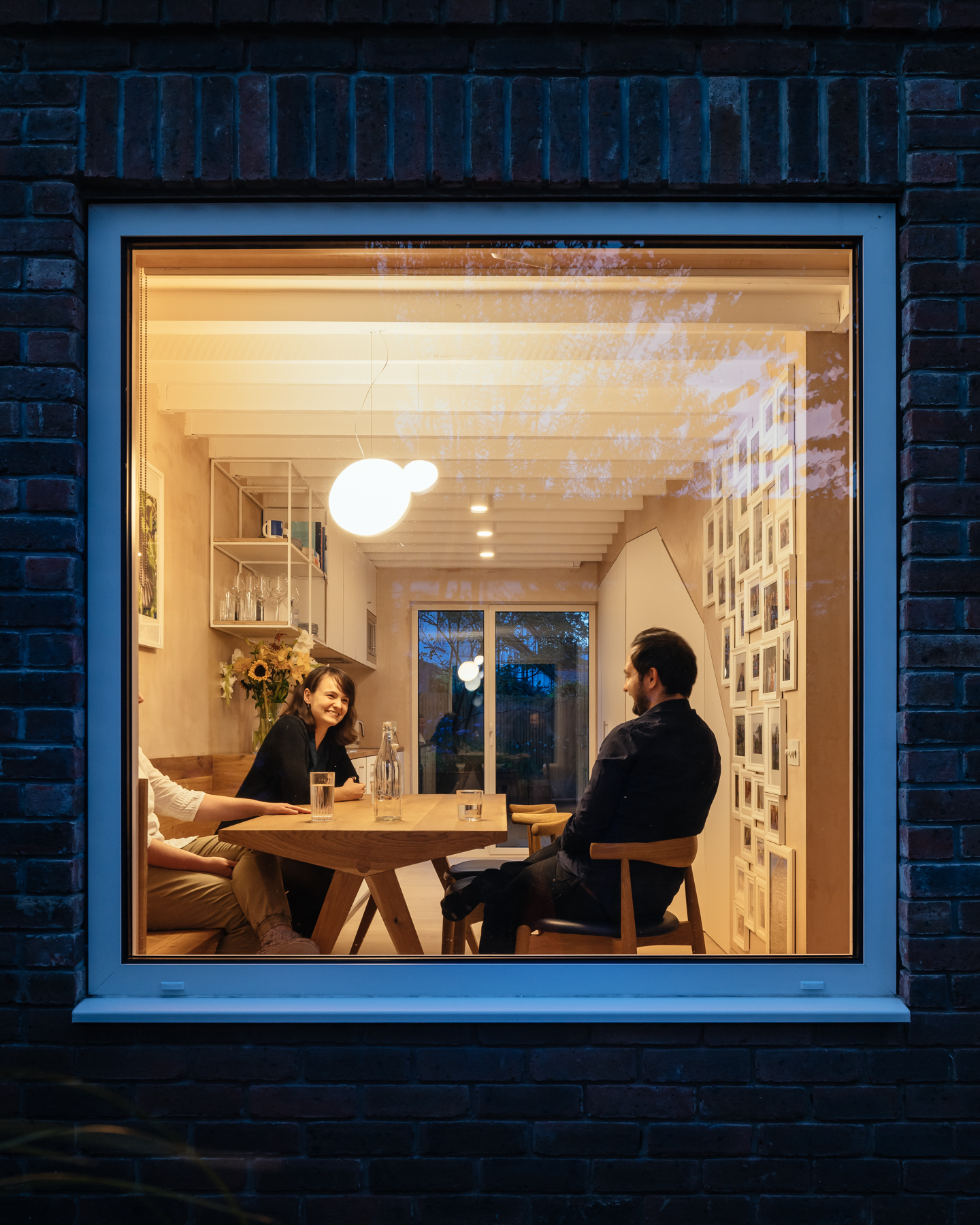
Respectful of the appearance of the council estate, we did not extend the house but rather took an investigative approach on how to make a tiny volume feel spacious and open. On the front facade, we removed the overly detailed bay window and replaced it with a larger square window framing the garden.
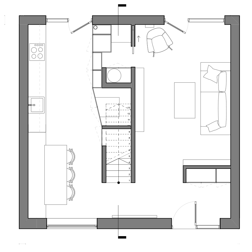
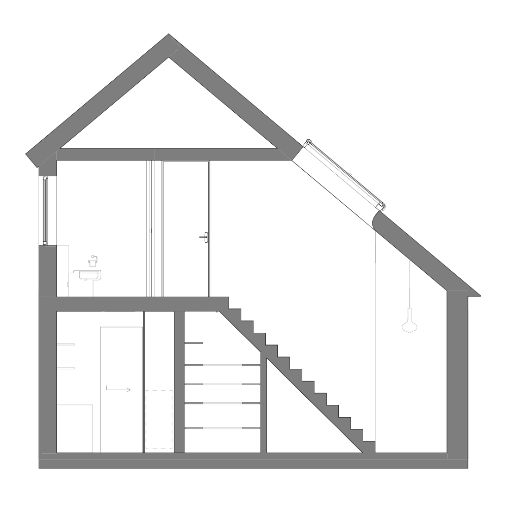
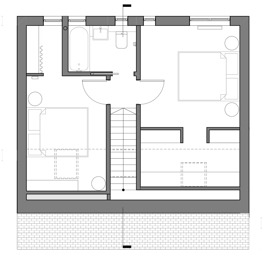
On the inside, we packed the functional core of the house around the stair and heating source, both of which we preserved as existing. Part of a communal heating system, the pre-feed water tank emanated a significant amount of heat at any time. We made use of this by (1) organising the laundry room around the tank to create a perfect place to dry clothes, and (2) relocating the 1st floor bathroom right above the tank to have a sustainably warm floor, without the use of an underfloor heating system.
This configuration allowed the other functions to gravitate in an open, but clearly defined plan organised around the idea of privacy and connection to the outside. Paradoxically, although part of an open plan, each space has a different atmosphere defined by the function it serves.
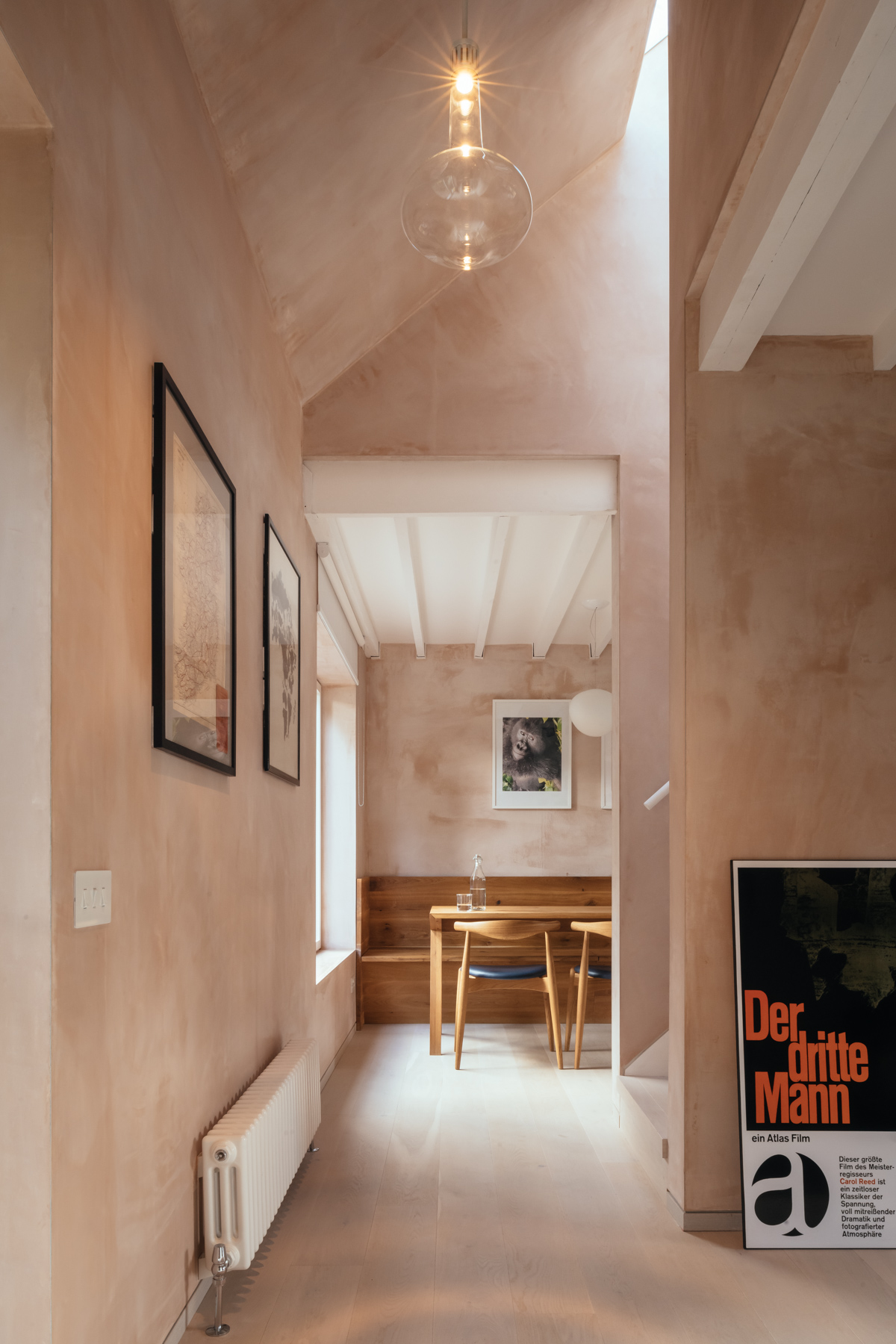
At the entrance lobby, by incorporating the old external loggia as part of the interior and opening the ceiling to the pitched roof, we turned a tight space into an entrance that feels grand and inviting.
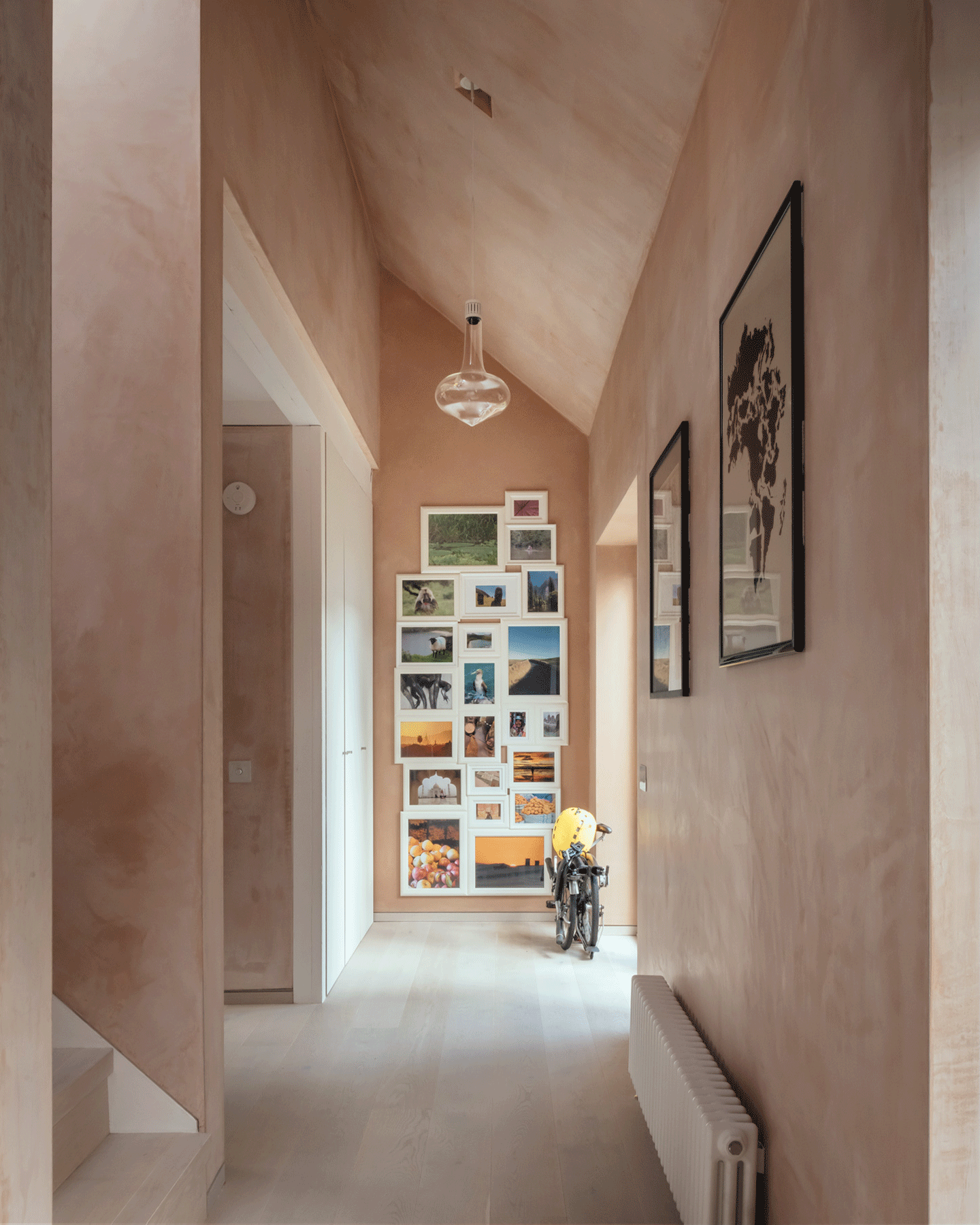
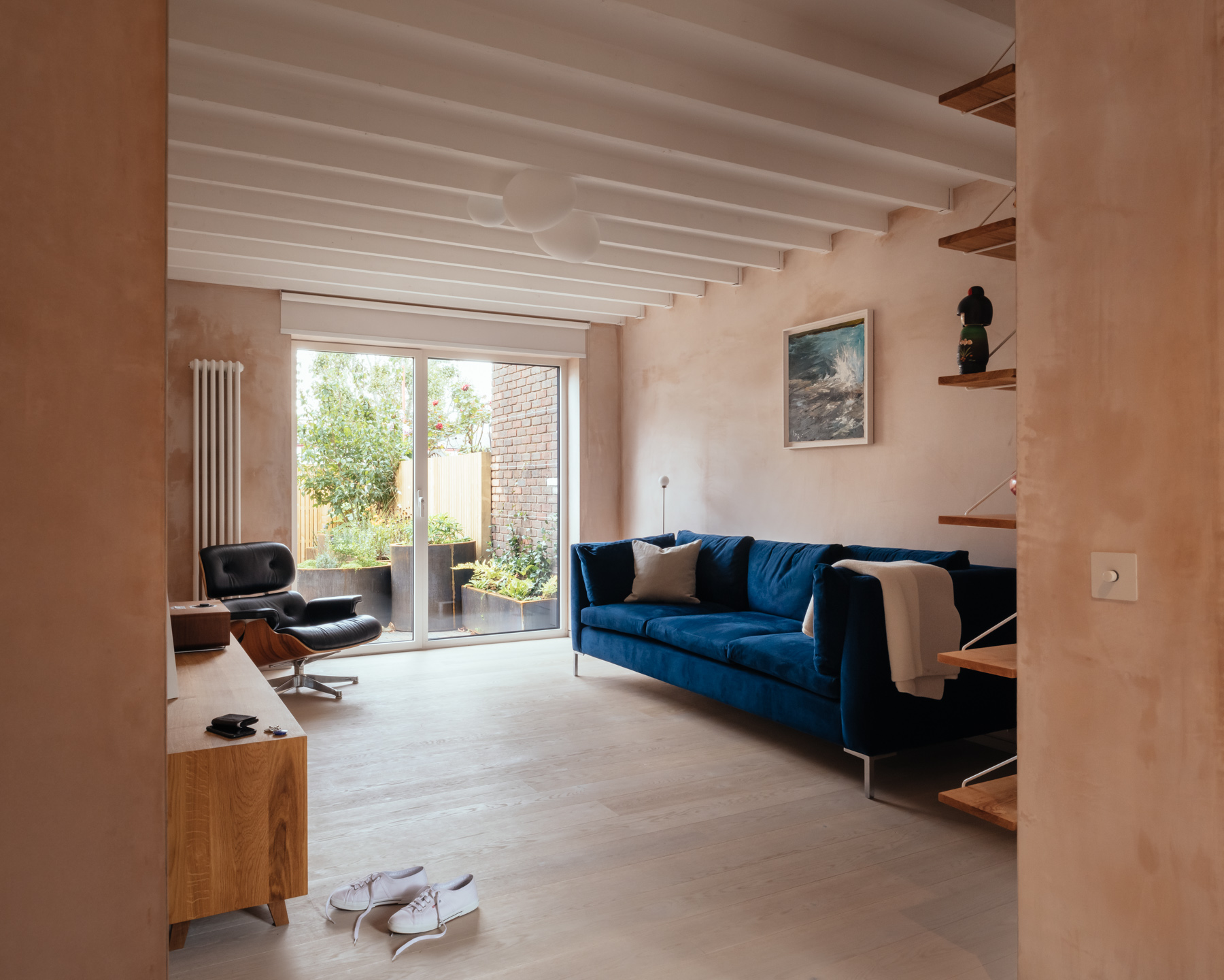
The original structural joists are now exposed to resurrect the spirit of the old house, bringing authenticity and time into the design, while making a 2.4 m ceiling feel tall.
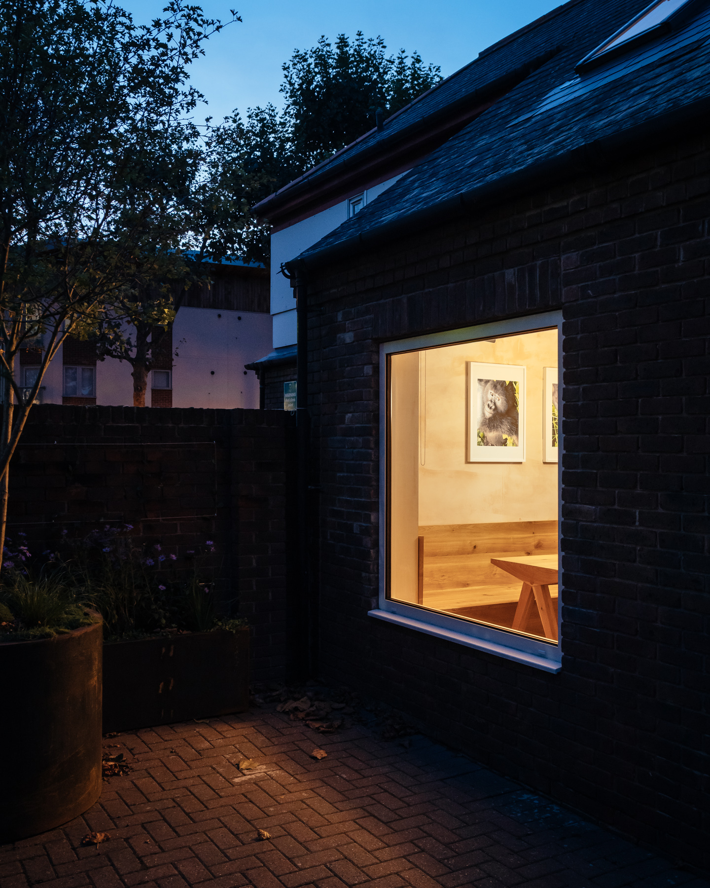
To highlight the qualities of space, light and textures, we limited the finishes spectrum to only three, complementary materials. White painted ceiling joists and whitewashed oak flooring are tied together by a plaster finish which reacts in the presence of natural light.
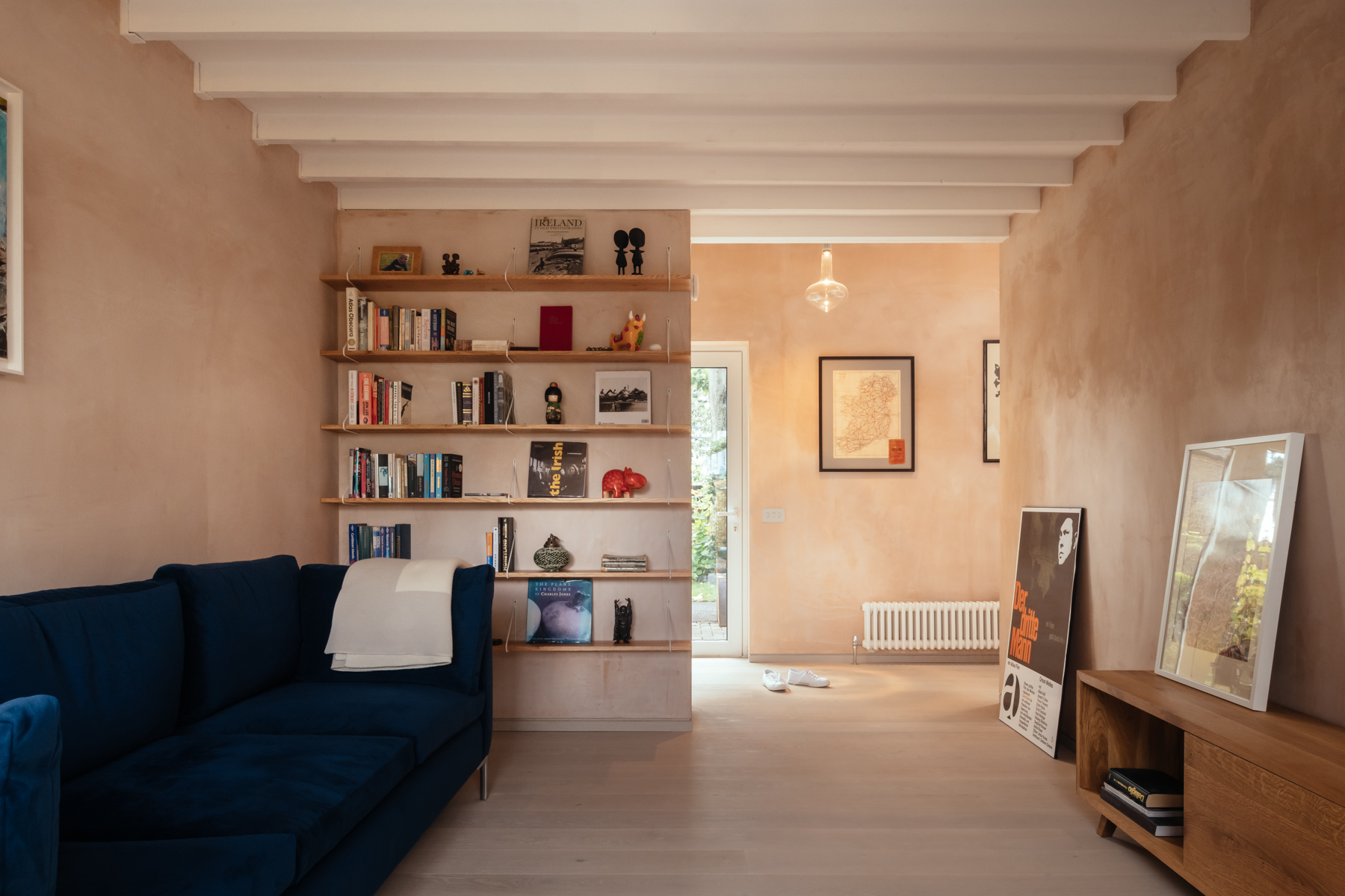
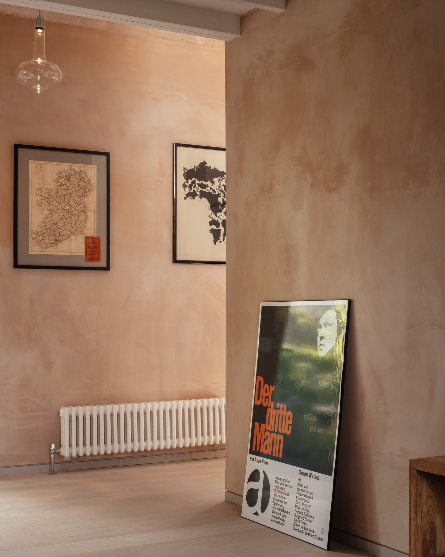
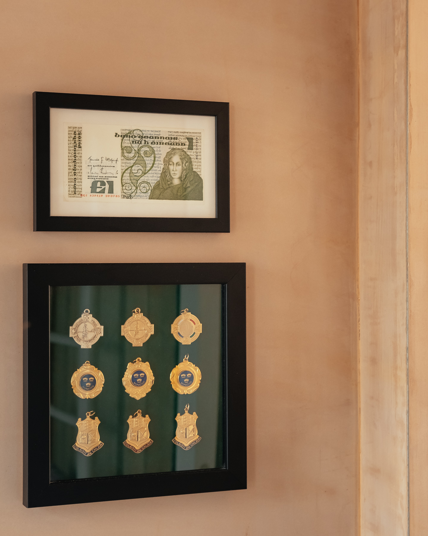
The plaster creates a warm background for exhibiting items dear to the client as art, photography or objects from her trips around the world.

Having too much plaster on the walls can be overpowering, if not counterbalanced by the right design elements. Therefore, the furniture is brought in to stand out and reduce the plaster's dominance by effectively turning it into a subtle background.
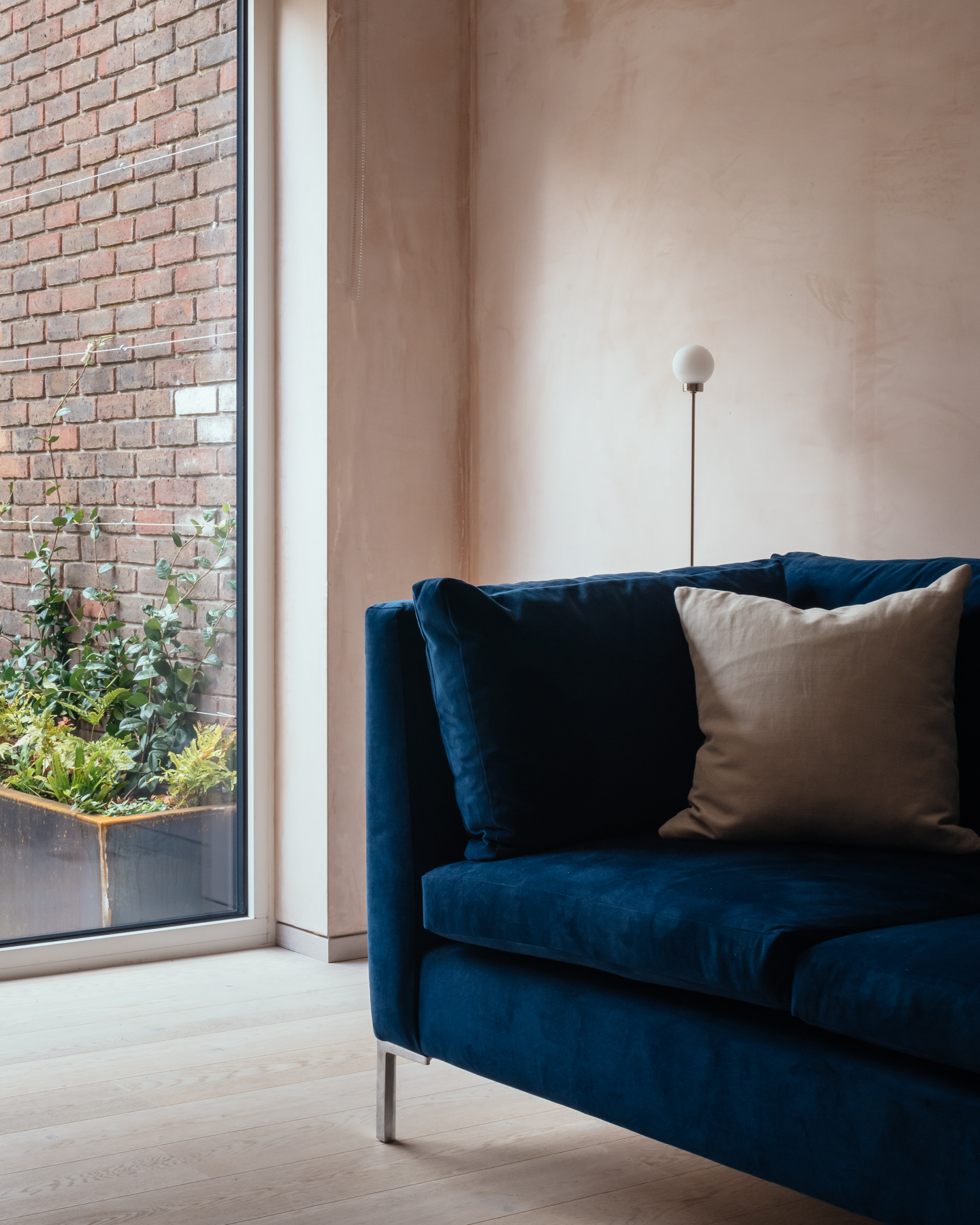
On one hand, a blue velvet couch and stainless steel floor lamp bring contrasting, cold elements into the design.
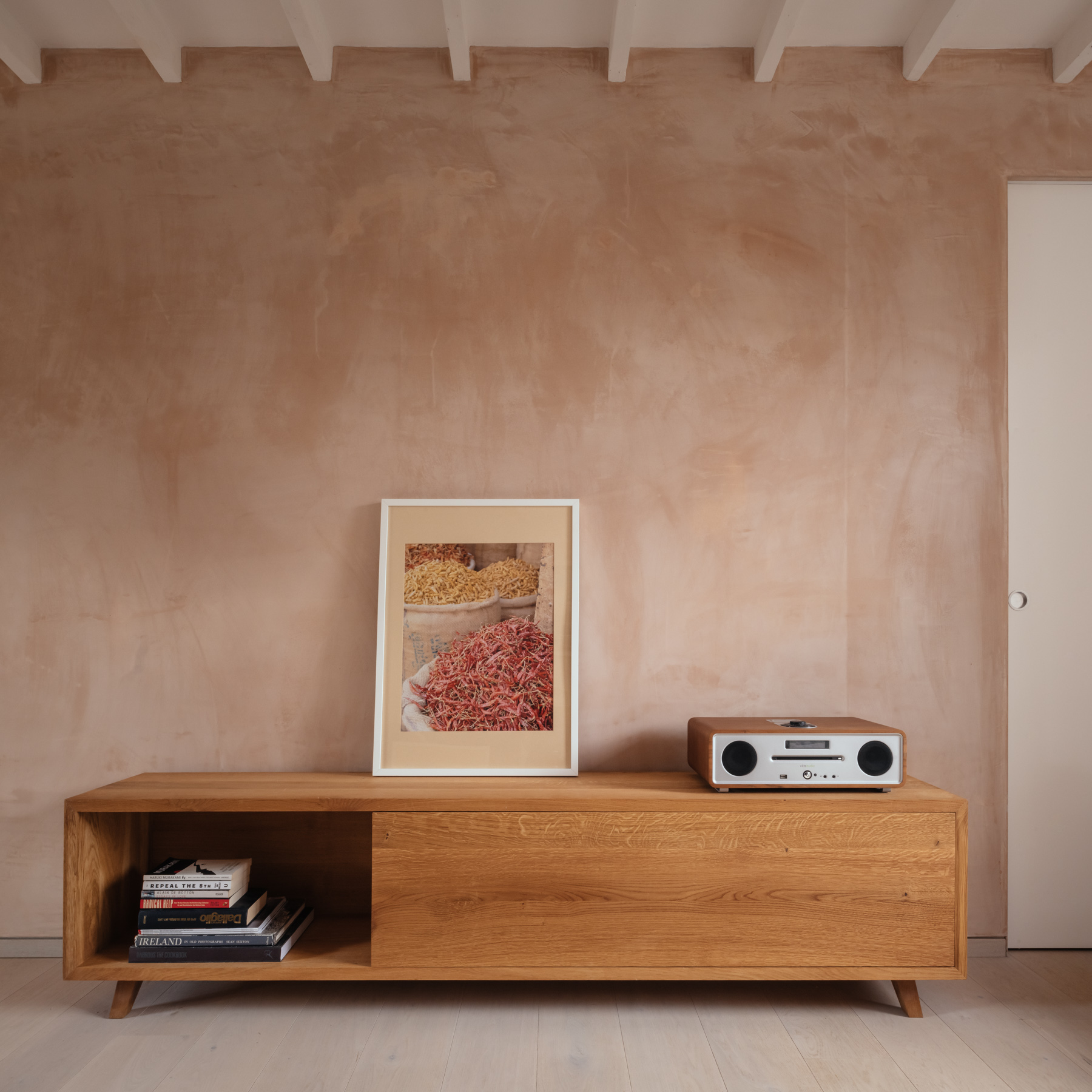
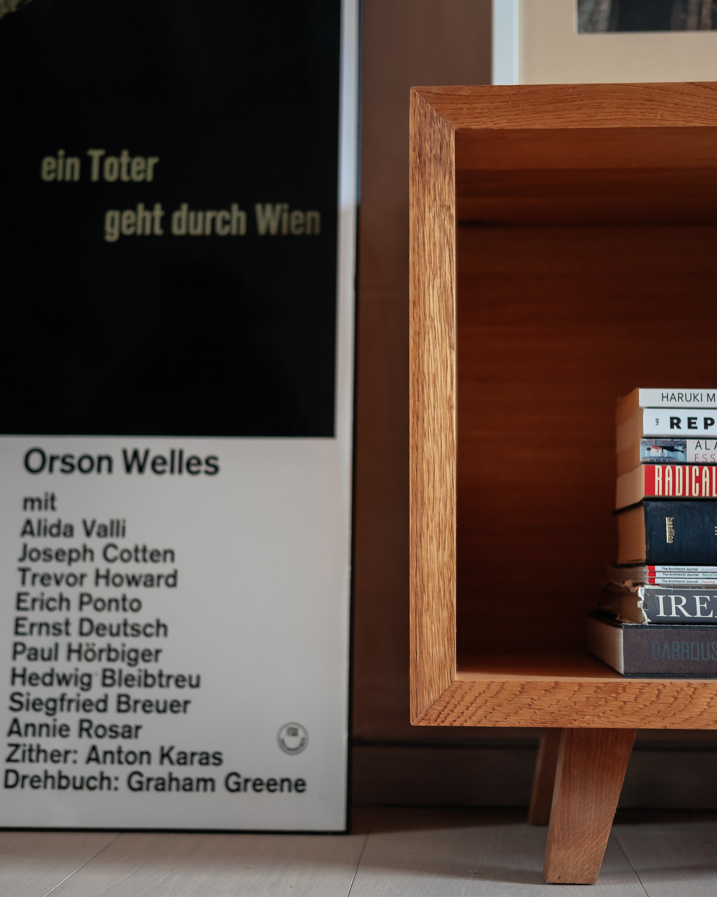
On the other hand, a series of solid oak joinery designed by VATRAA uniquely for this project brings craftsmanship into the composition and makes the plaster look less warm and more neutral by comparison.
In the living room, the low cabinet is designed in minimalist lines to enhance the beautiful texture of the wood.
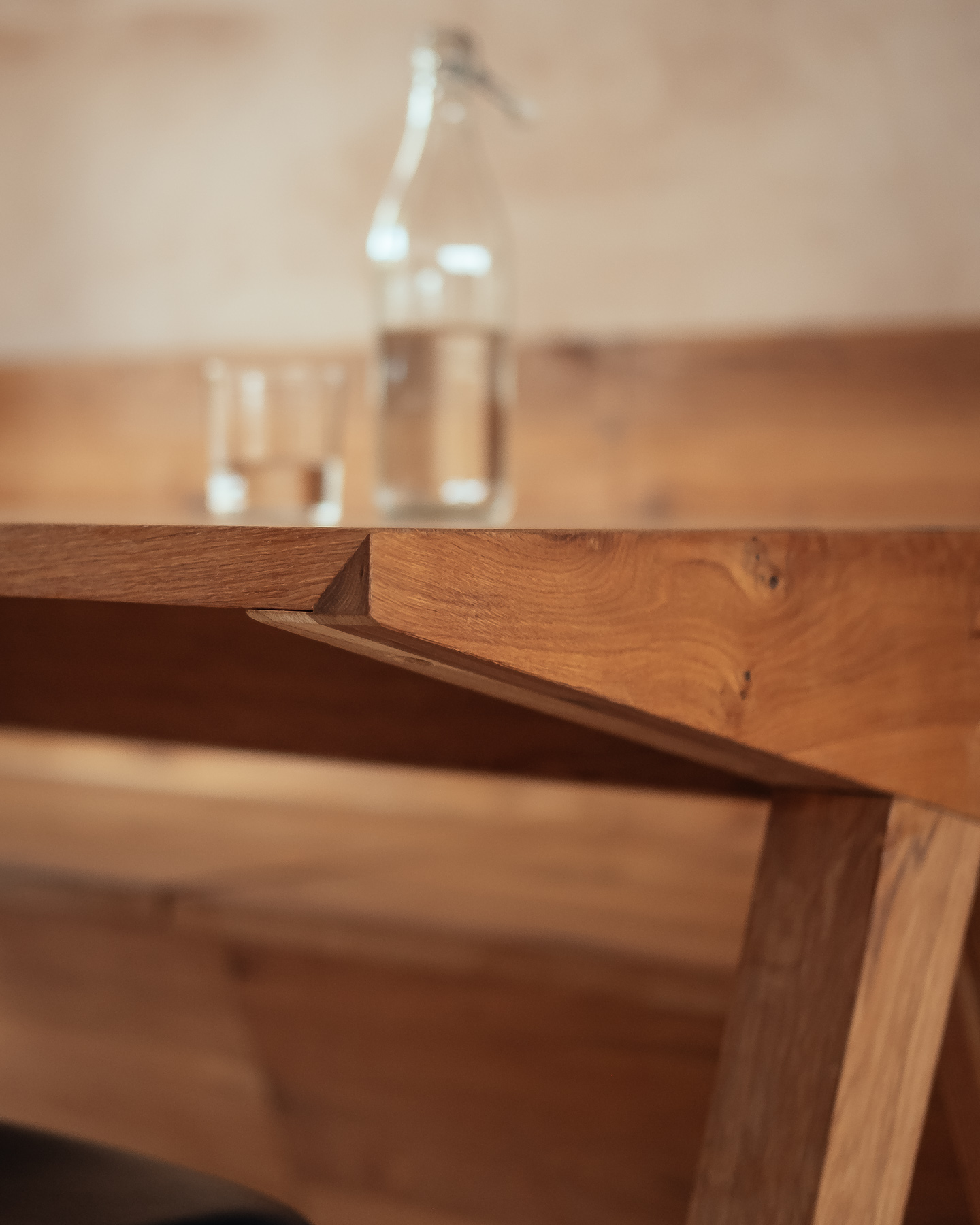
The joinery series is continued into the dining area, where we designed a bespoke table and bench to suit the homeowner's way of entertaining. We tested different seating layouts to arrive at the conclusion that the dining table legs should be pushed to the ends to allow for comfortably seating 3 people in a row in such a tight space. As a result, we turned this odd detail into a feature and worked closely with our joiner to overcome the technical constraints in an elegant way.
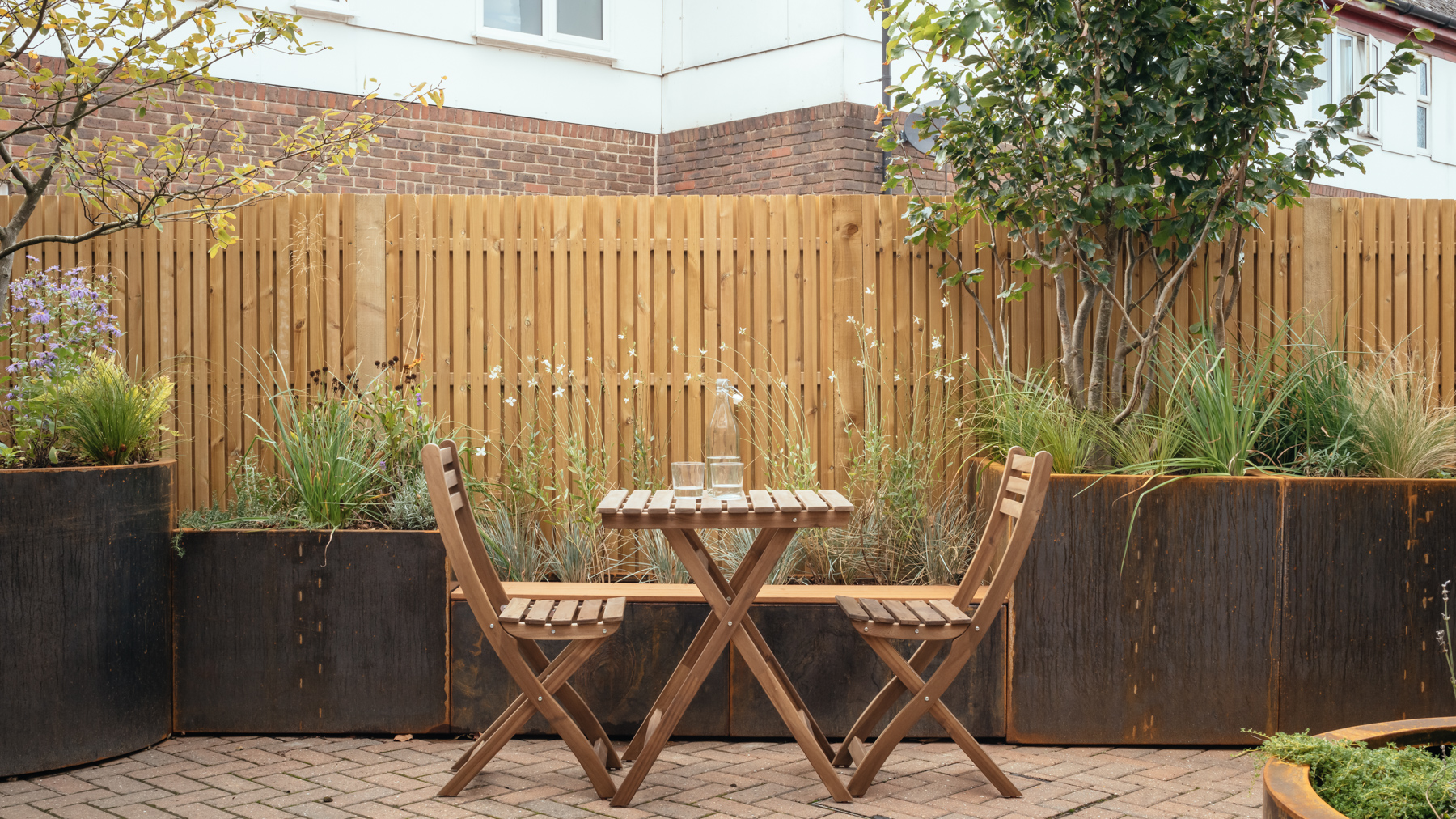
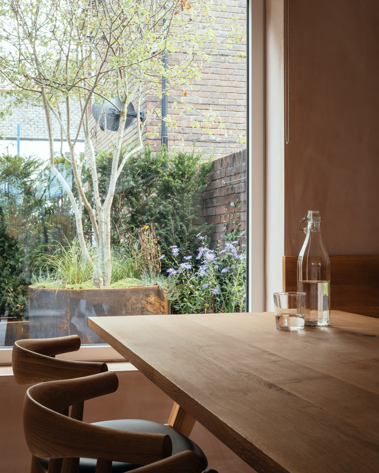
Any barriers between the kitchen and dining area are removed to create a flowing space in strong connection to an evergreen garden to the front and a seasonal garden to the back.
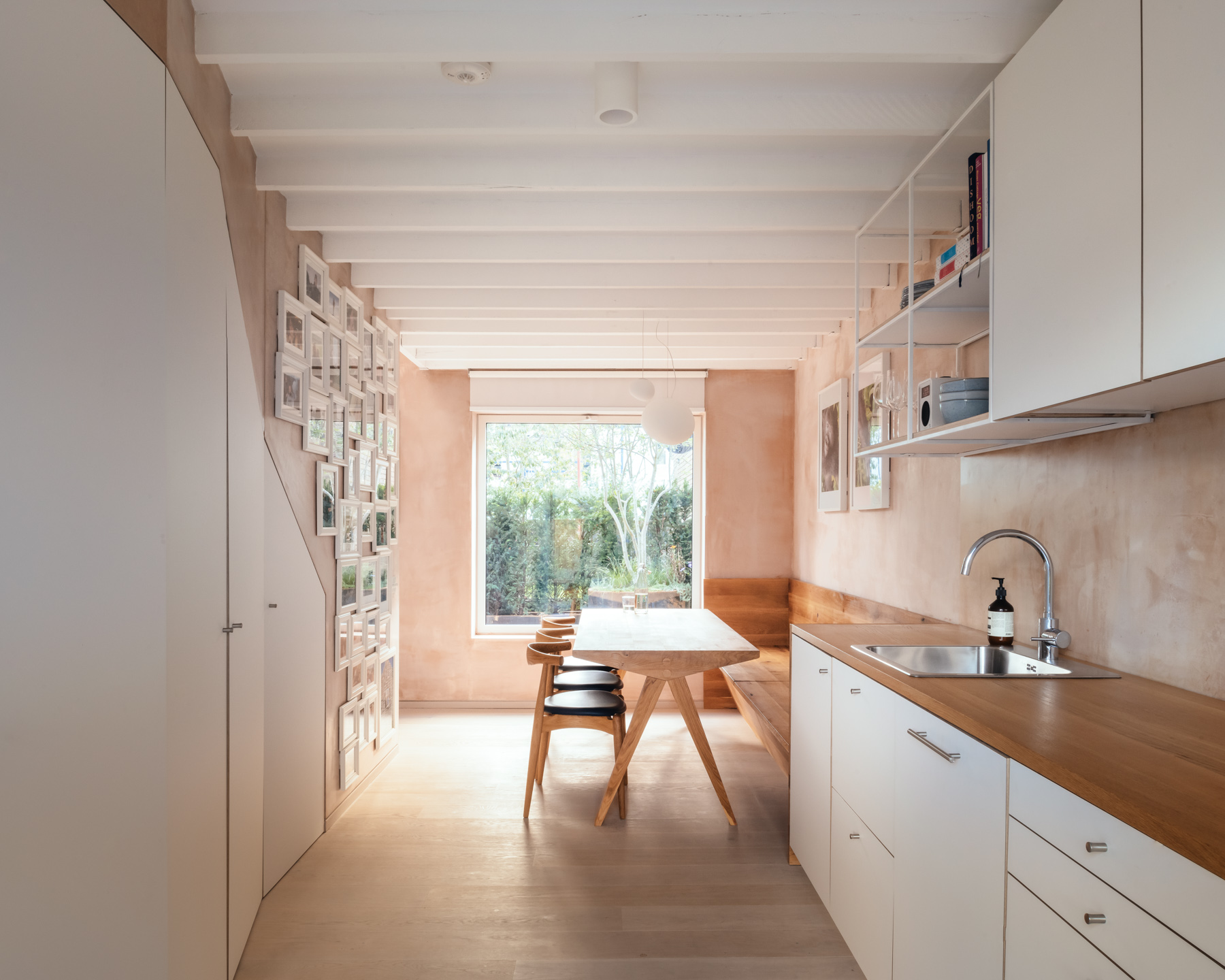
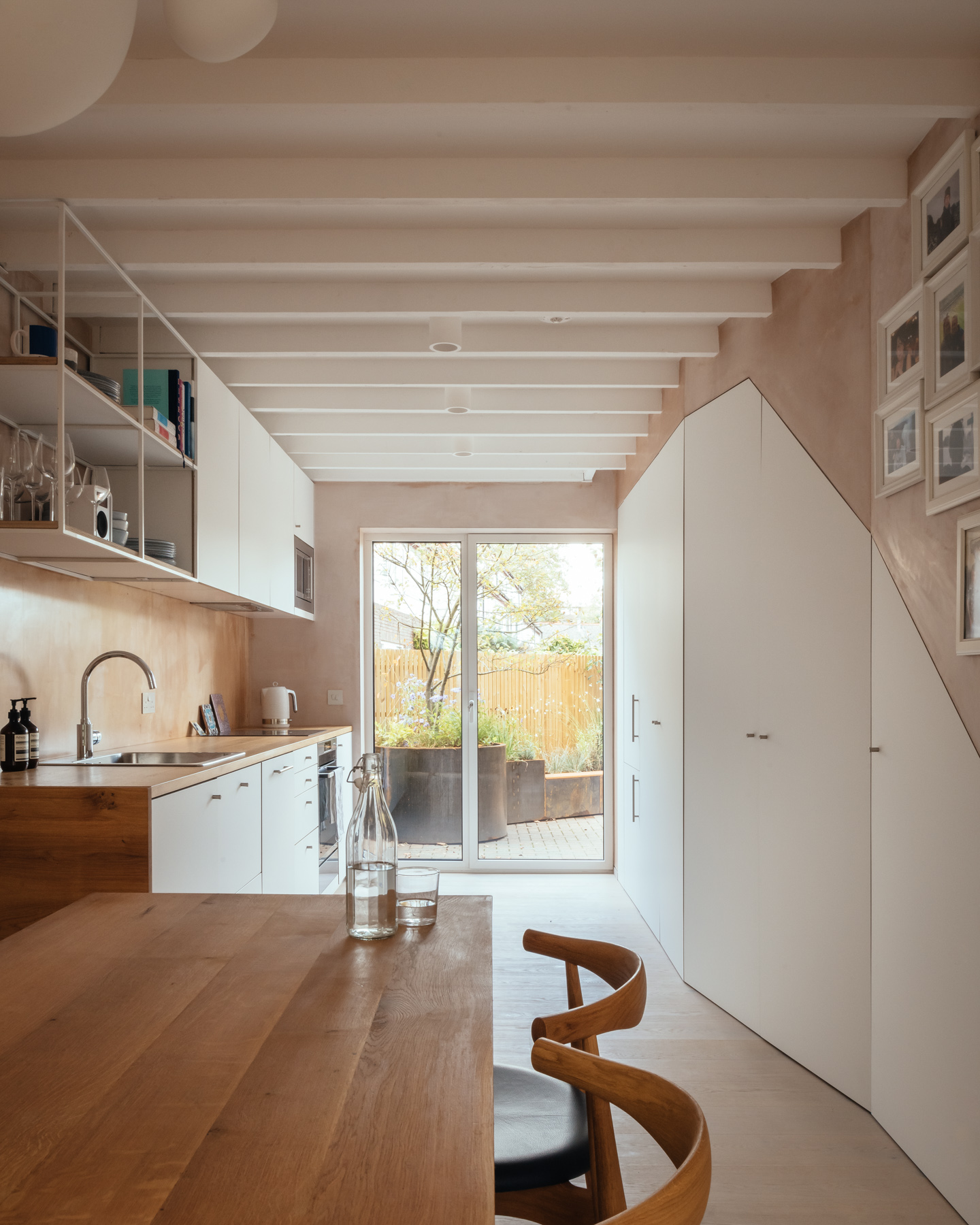
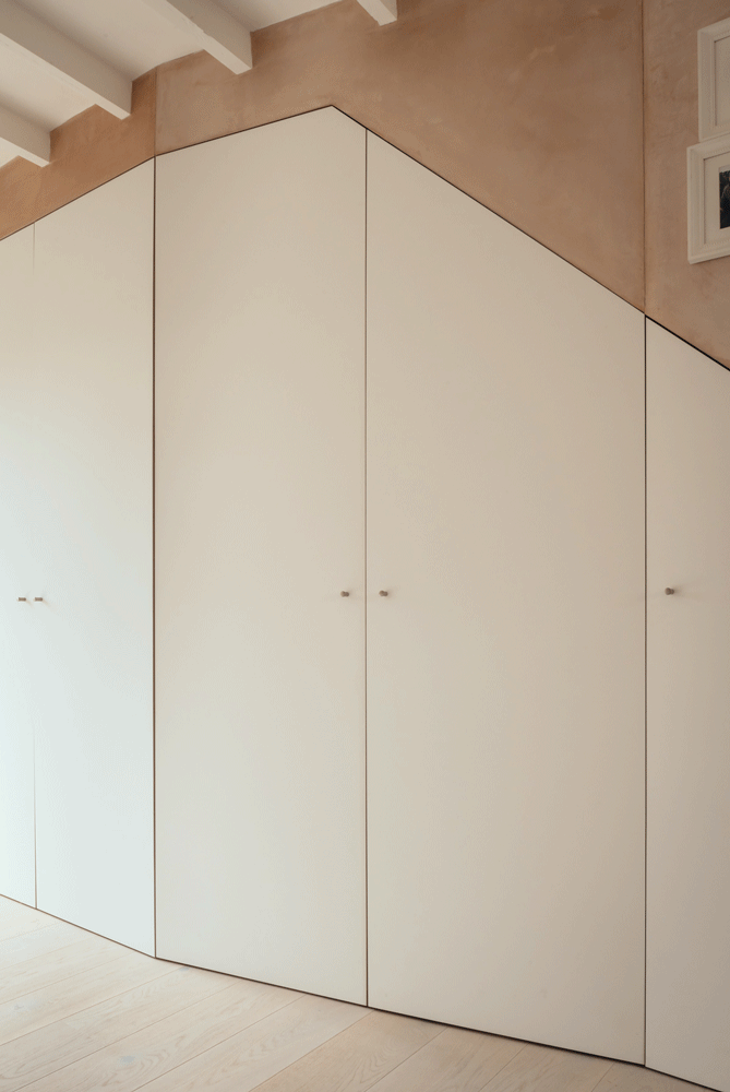
Although part of a single space, the kitchen and dining are articulated by a generous pantry. Displayed at an angle, the pantry meets the client's storage needs while absorbing the difference in width between the narrow stair and the wider storage functions below it.
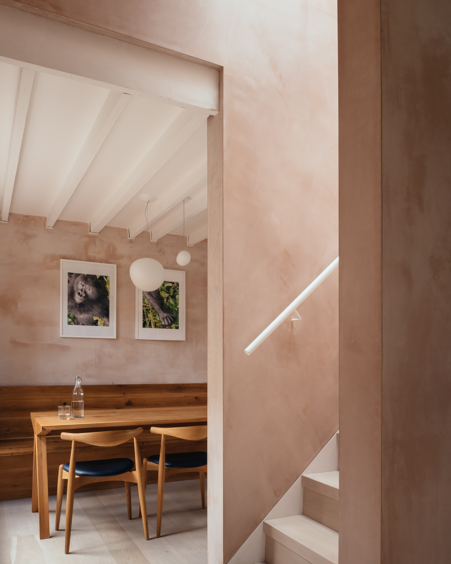
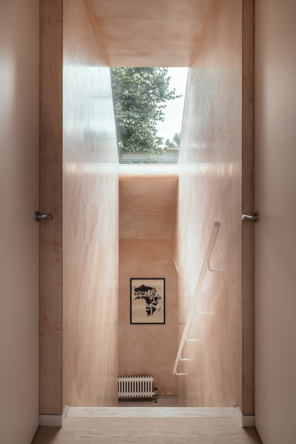
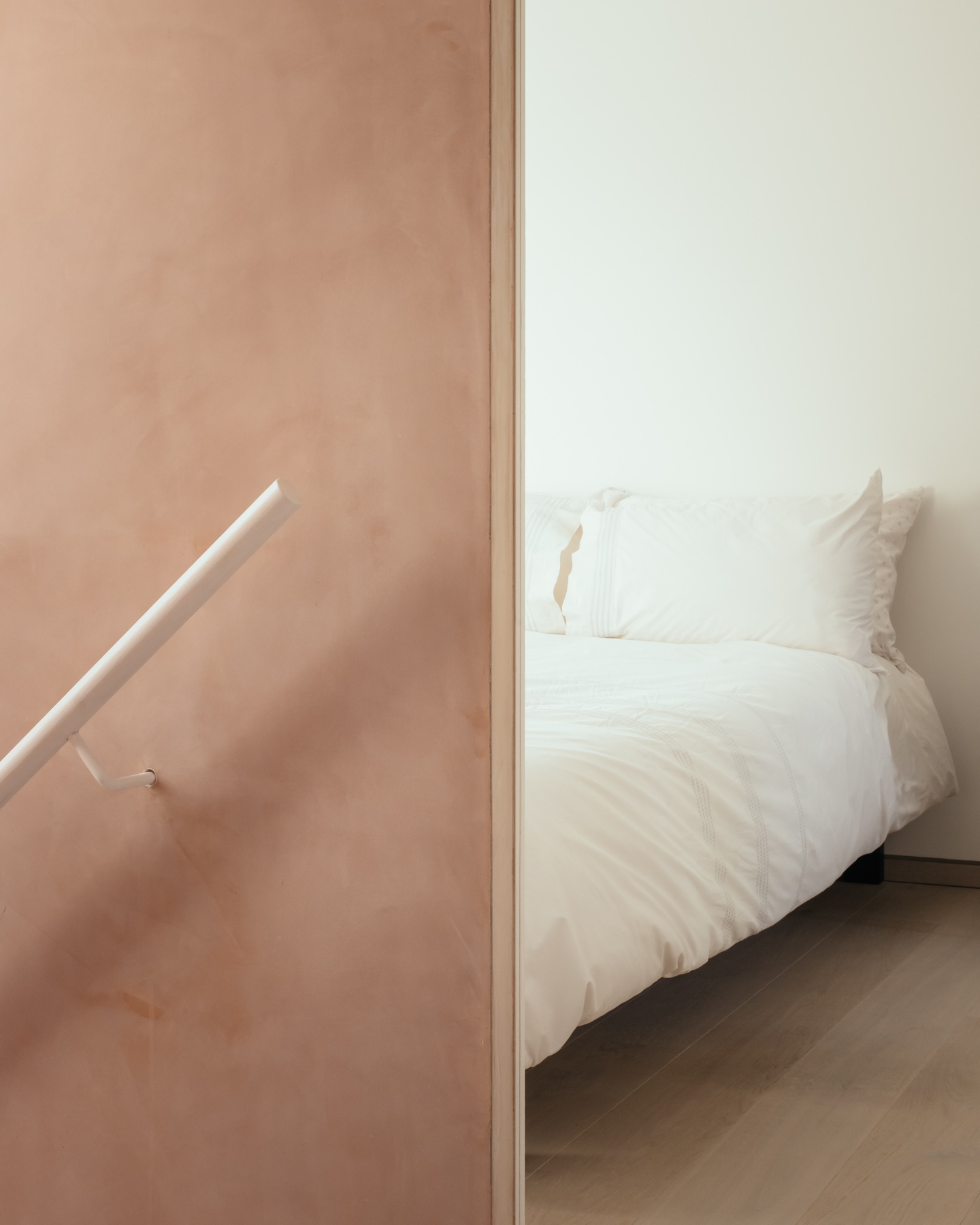
Leading to the first floor, the stairwell design is reduced to its essence.
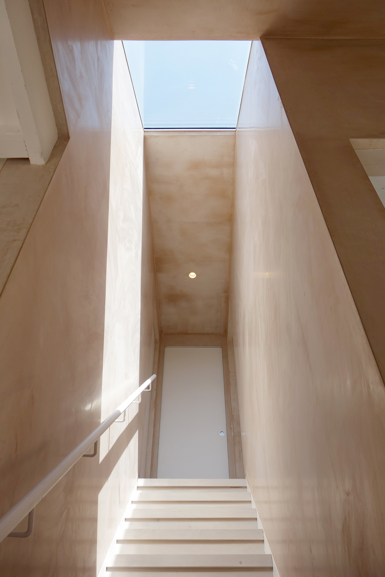
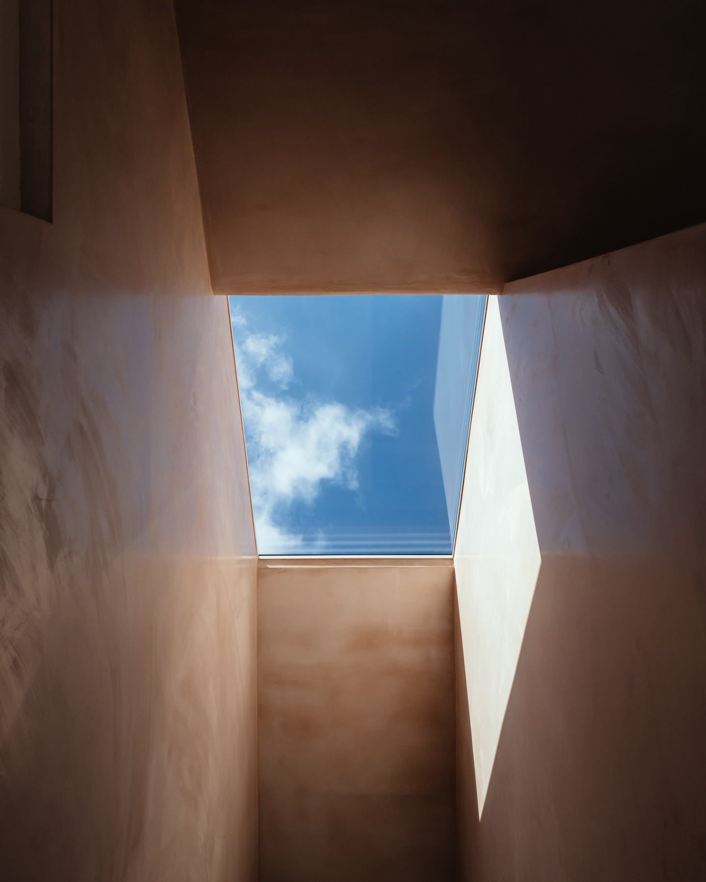
A large, frameless skylight takes a scenographic role creating a play of shadows, light and reflections.
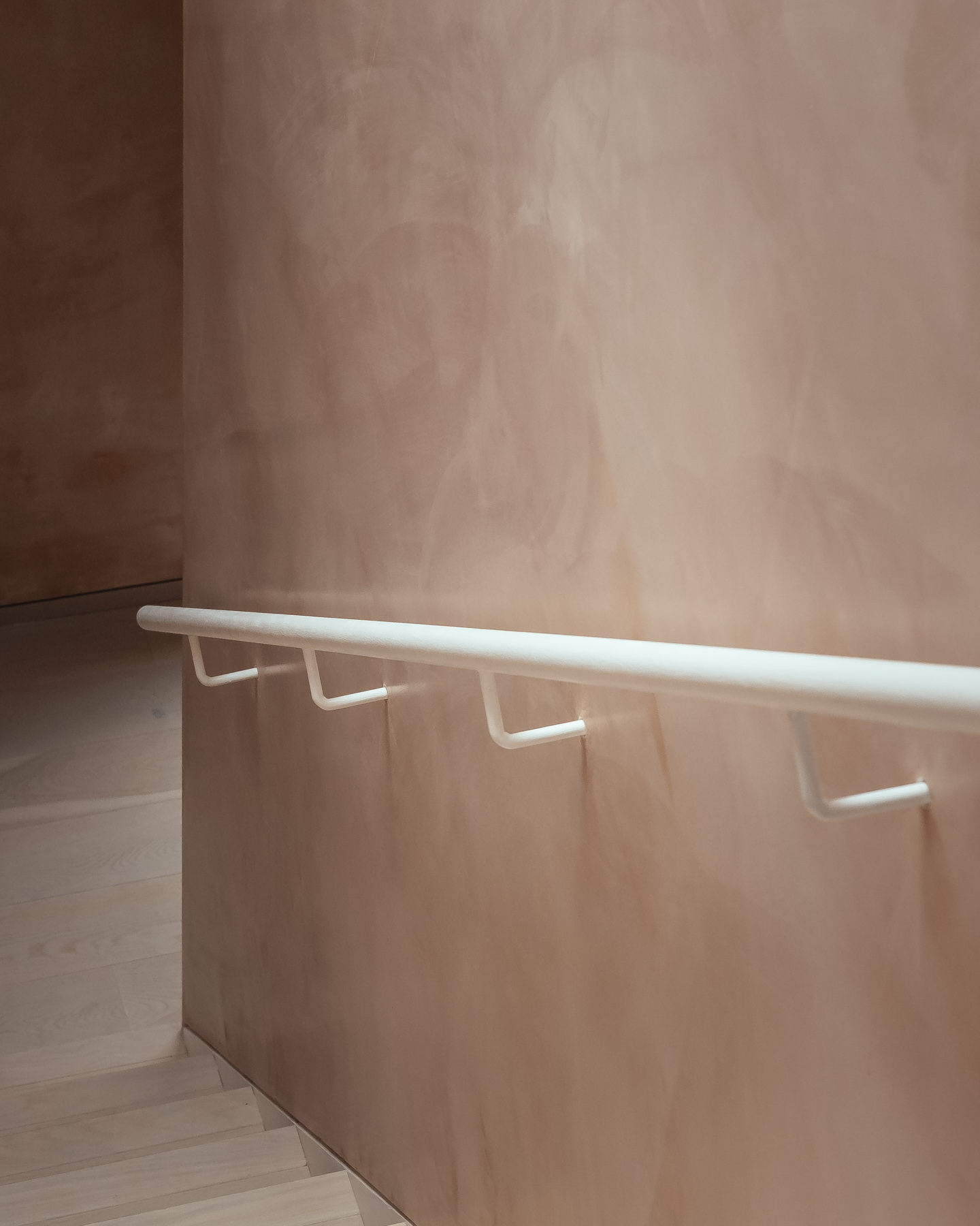
Minimalist details to the stair are designed not to distract, but to allow the viewer to focus on the overall atmosphere.
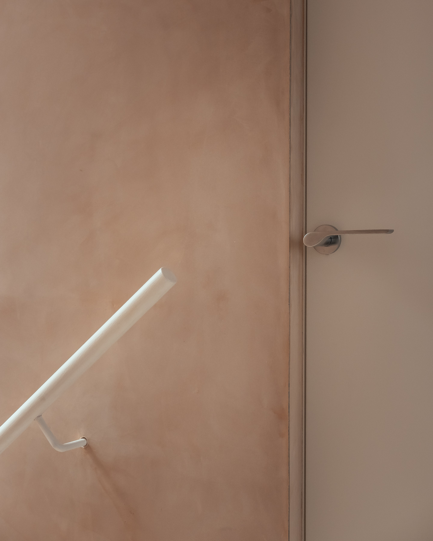
The plaster, a banal ‘British Gypsum Multifinish’ applied with extra skill and care to achieve a reflective surface eliminated the need for paint, saving cost and resources while allowing the overall atmosphere to change in the presence of natural light.
Under sunlight, the space becomes vibrant and warm, while under cloudy weather it becomes reflective and makes an 80 cm narrow stairwell feel large and monumental.
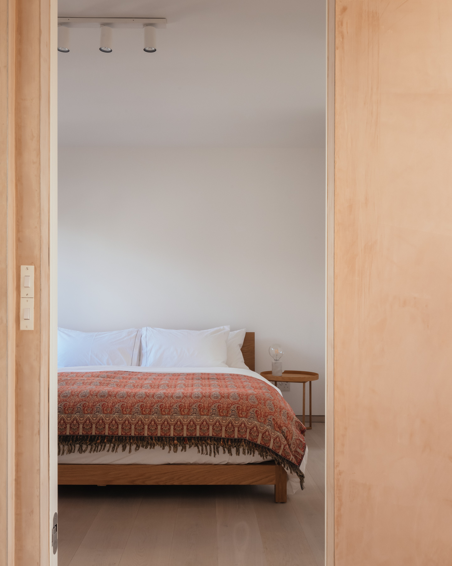
White walls are brought into the bedroom areas to create a neutral atmosphere in contrast to the vibrant day zone.
As a result, the morning transition between the night and day zones becomes an event, giving the homeowner a sensation of energy, immediately as she steps into the stairwell and descends to the ground floor.
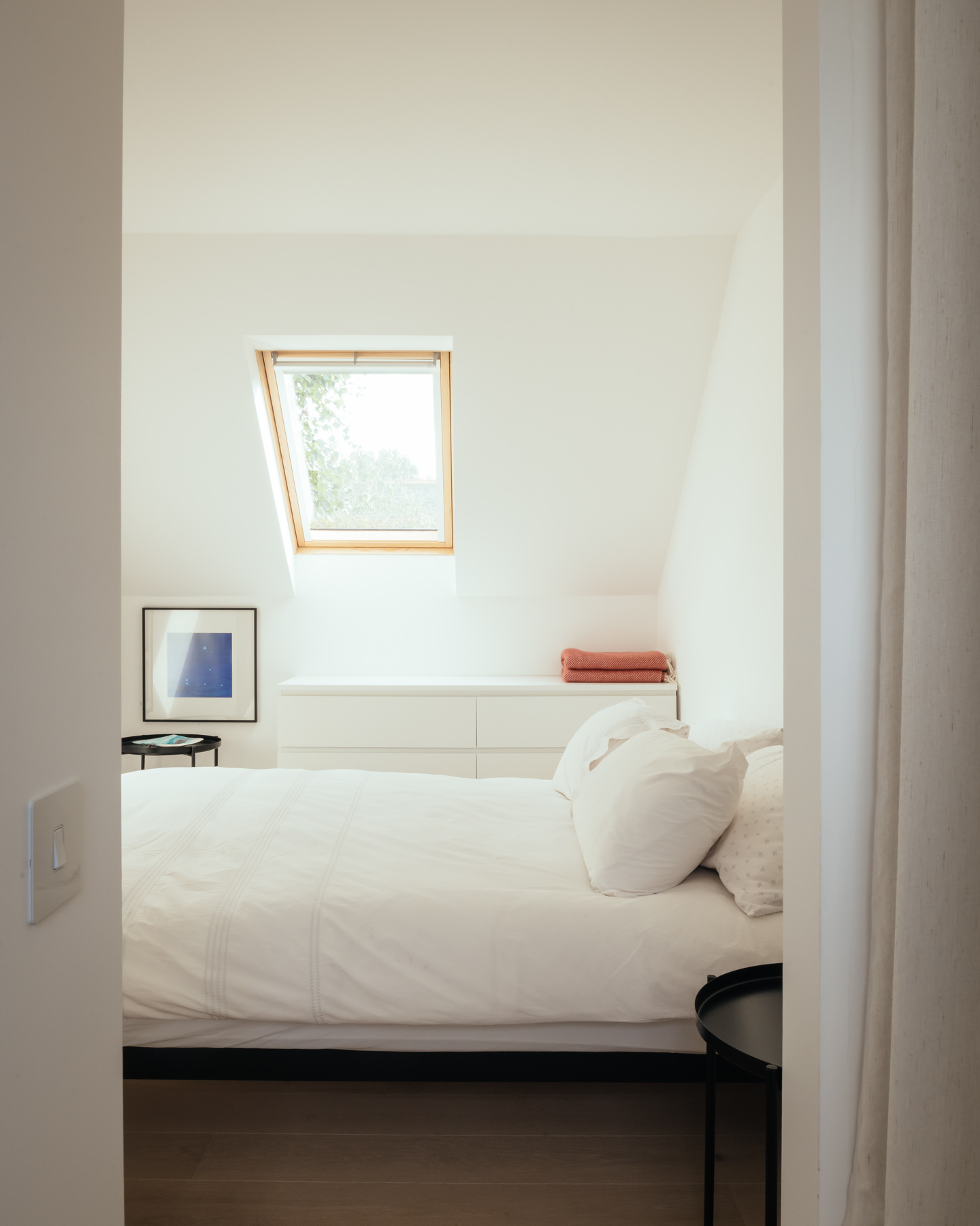
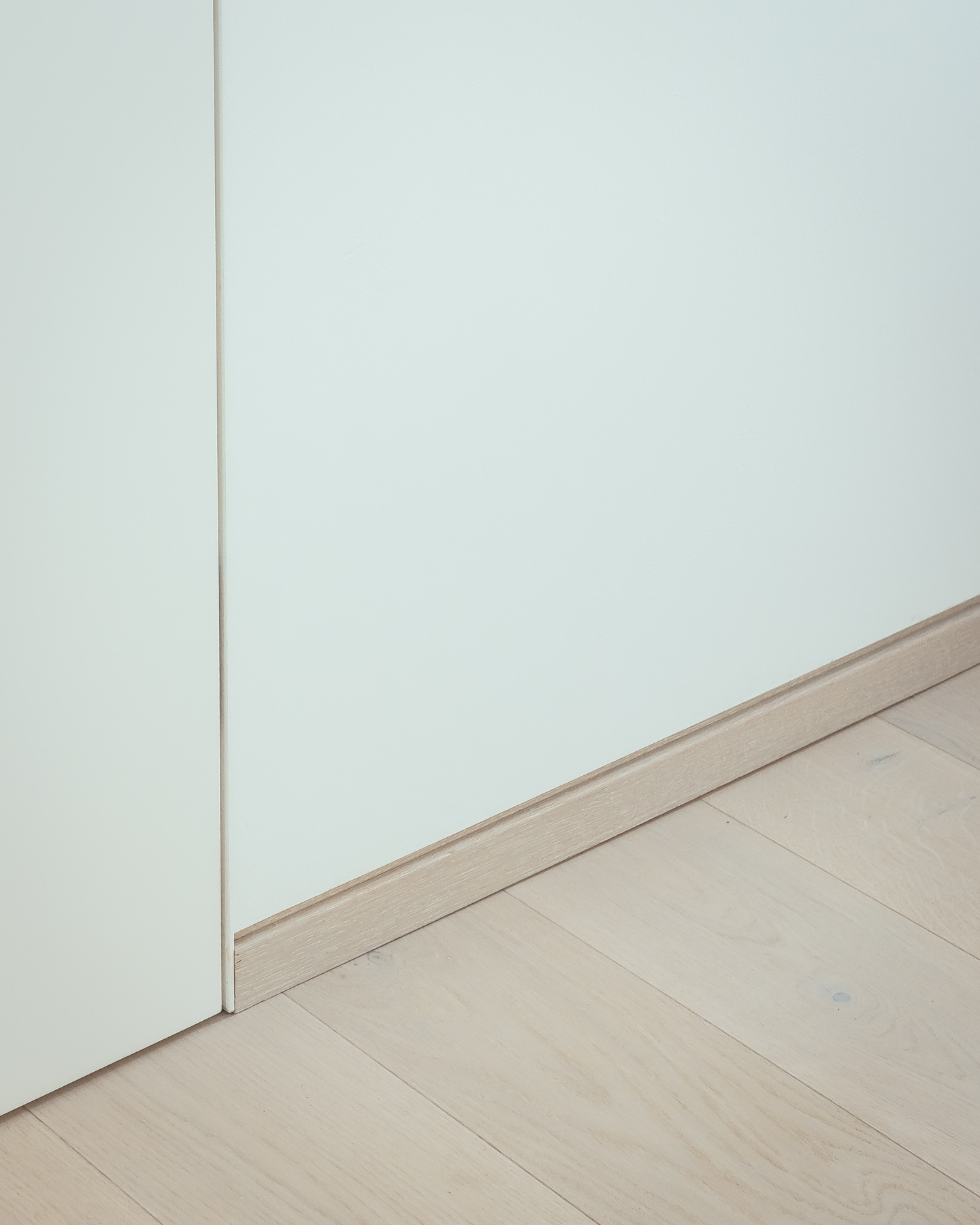
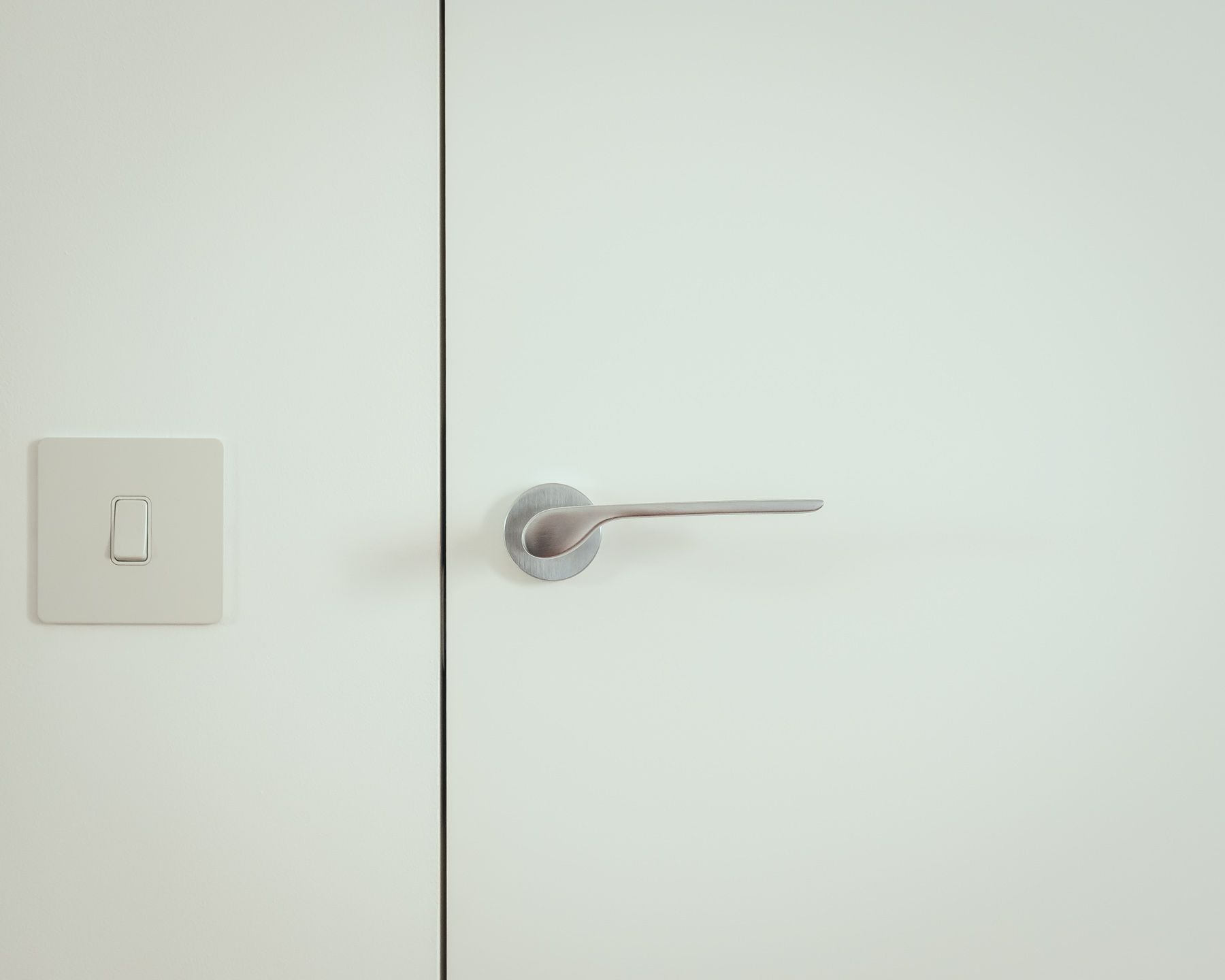
Carefully detailed skirting and door details complete the design and make the tiny bedrooms feel neat and uncluttered.
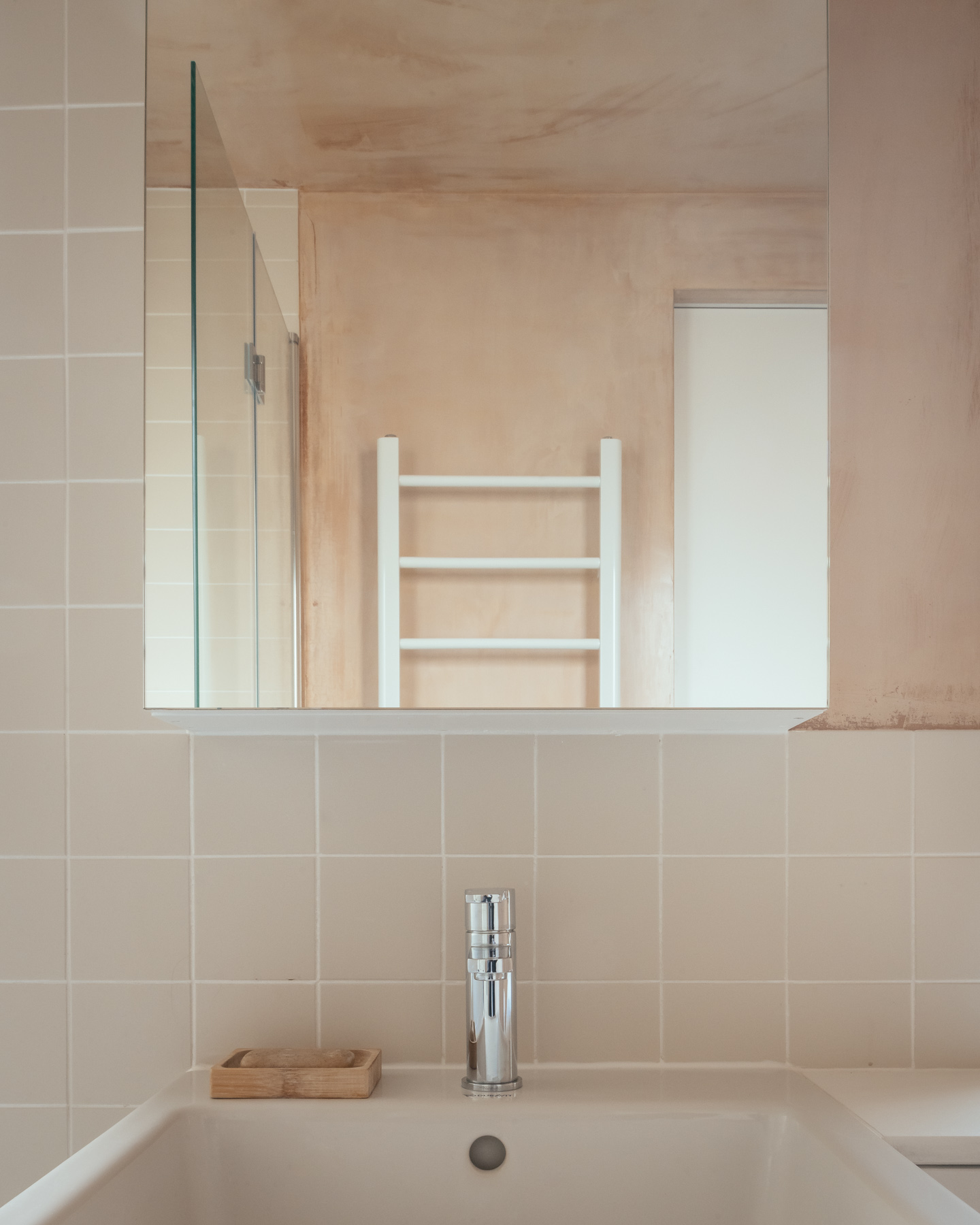
The bathroom area follows the same principles as the rest of the house, with minimalist details and special objects displayed on the plaster background.
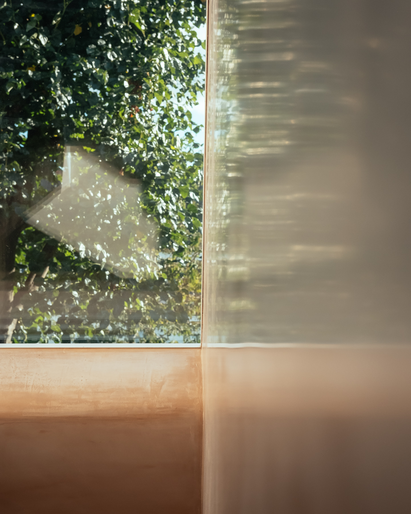
On the rear facade, the interventions are also discrete. We looked to avoid major structural changes and only replaced the windows with hidden sash frames to provide curated views of the garden.
Ultimately, sustainability did not come with artificial measures but with practical solutions that gave a new purposeful life to a disregarded building. The result demonstrates that if fully embraced, the constraints and specifics of the project can lead to surprising solutions grounded into the actual context we operate in.